Wednesday, September 12, 2007

Application of long/turbo RSI+MACD (Part 1)

Rules of data reading RSI/MACD.

  • Week, day, intraday, in intraday to consider day and weeks, that is the general situation in the market.
  • To choose a corresponding time-frame.
  • The Nobility extreme values of indicators for the chosen tool.
  • Each market will have own trend which should not be considered at trade in other market.
  • Inertia of the market - the market should cool down or heat up, then there is a consolidation.
  • In the price risks, and also a news background and expectations of traders are considered all.

The above picture is a full set of graphs which are necessary for trade on system RSI/MACD. Here three different tools and only one time-frame for everyone. I do not change a symbol of the graph and its time-frame within all trading day in system RSI/MACD. Absolutely everything, that is necessary to us for trade in the market, is on this set of graphs. And we do not pay attention on what another. All is simple.

We use only two RSI the indicator and one MACD at trade. The first is RSI with the period 9, displayed red color (a thick line) which refers to RSI. Another is RSI with the period 3, displayed as red (a thin line), and named Turbo RSI or TRSI. MACD 9 or 8 is displayed navy (a thin line) by color.

Establish the unique graph with the unique time-frame for the tool. At transition to other time-frame it is necessary to consider frequency rate a time-frame in during trading session.

Choose quiet colors. Establish the size and color of the text and any other element of the graph so that they strongly were not allocated. As much as possible allocate both RSI the indicator and MACD. Make their convenient for reading. They are the only thing, that we wish to allocate during trade. Any other information is not important. If something is allocated another besides patterns RSI you will be focused on it and worsen time of your reaction.

Everything, that you need to do within all day is to wait for occurrence RSI/MACD of a pattern. It will be uneasy employment. Good trade - by definition patient. Reconcile to it. We wait for entrance signal RSI/MACD. We enter into trade. We wait RSI/MACD a signal to an output. We leave trade. All simply and definitely, very clearly and well works.


Source:(http://www.forex-forecast.net)
Saturday, September 01, 2007

Trading The MACD Divergence

Moving average convergence divergence (MACD), invented in 1979 by Gerald Appel, is one of the most popular technical indicators in trading. MACD is appreciated by traders the world over for its simplicity and flexibility because it can be used either as a trend or momentum indicator.


Trading divergence is a popular way to use MACD histogram (which we explain below), but, unfortunately, the divergence trade is not very accurate - it fails more than it succeeds. To explore what may be a more logical method of trading MACD divergence, we look at using the MACD histogram for both trade-entry and trade-exit signals (instead of only entry), and how currency traders are uniquely positioned to take advantage of such a strategy.

MACD: An Overview
The concept behind MACD is fairly straightforward. Essentially it calculates the difference between an instrument's 26-day and 12-day exponential moving average (EMA). Of the two moving averages that make up MACD, the 12-day EMA is obviously the faster and the 26-day is the slower. In the calculation of their value, both moving averages use the closing prices of whatever period is measured. On the MACD chart, a 9-day EMA of MACD itself is plotted as well, and it acts as a trigger for buy and sell decisions. MACD generates a bullish signal when it moves above its own 9-day EMA, and it sends a sell sign when it moves below its 9-day EMA.

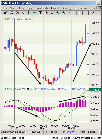
The MACD histogram is an elegant visual representation of the difference between MACD and its 9-day EMA. The histogram is positive when MACD is above its 9-day EMA and negative when MACD is below its 9-day EMA. If prices are rising, the histogram grows larger as the speed of the price movement accelerates and contracts as price movement decelerates. The same principle works in reverse as prices are falling. See Figure 1 for a good example of a MACD histogram in action.


Figure 1 - The above is an example of MACD histogram. Note that as price action (top part of the screen) accelerates to the downside, the MACD histogram (in the lower part of the screen) makes new lows and vice versa as prices turn.

As it responds to the speed of price movement, the MACD histogram is the main reason why so many traders rely on this indicator to measure momentum. Indeed, most traders use the MACD indicator more frequently to gauge the strength of the price move than to determine the direction of a trend.

Trading Divergence
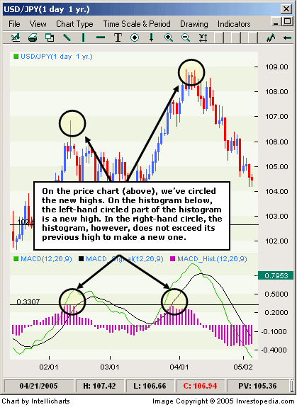
As we mentioned earlier, trading divergence is a classic way in which the MACD histogram is used. One of the most common set-ups is to find chart points at which price makes a new swing high or a new swing low but the MACD histogram does not, indicating a divergence between price and momentum. Figure 2 illustrates a typical divergence trade.


Figure 2 - Here is a typical (negative) divergence trade using a MACD histogram. At the right-hand circle on the price chart, the price movements make a new swing high, but at the corresponding circled point on the MACD histogram, the MACD histogram is unable to exceed its previous high of 0.3307. (The histogram reached this high at the point indicated by the lower left-hand circle.) The divergence is a signal that the price is about to reverse at the new high, and as such, it is a signal for the trader to enter into a short position.

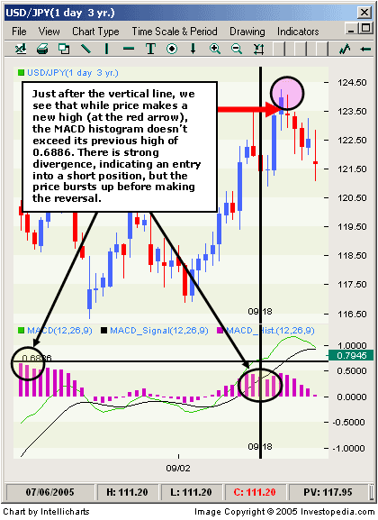
Unfortunately, the divergence trade is not very accurate - it fails more times than it succeeds. Prices frequently have several final bursts up or down that trigger stops and force traders out of position just before the move actually makes a sustained turn and the trade becomes profitable. Figure 3 demonstrates a typical divergence fakeout, which has frustrated scores of traders over the years.


Figure 3 - A typical divergence fakeout. Strong divergence is illustrated by the right circle (at the bottom of the chart) by the vertical line, but traders who set their stops at swing highs would have been taken out of the trade before it turned in their direction.

One of the reasons that traders often lose with this set up is they enter a trade on a signal from the MACD indicator but exit it based on the move in price. Since the MACD histogram is a derivative of price and is not price itself, this approach is in effect the trading version of mixing apples and oranges.

Using the MACD Histogram for Both Entry and Exit
To resolve the inconsistency between entry and exit, a trader can use the MACD histogram for both trade-entry and trade-exit signals. To do so, the trader trading the negative divergence takes a partial short position at the initial point of divergence, but instead of setting the stop at the nearest swing high based on price, s/he instead stops out the trade only if the high of the MACD histogram exceeds its previous swing high, indicating that momentum is actually accelerating and the trader is truly wrong on the trade. If, on the other hand, the MACD histogram does not generate a new swing high, the trader then adds to his or her initial position, continually achieving a higher average price for his or her short.

Currency traders are uniquely positioned to take advantage of this strategy because with this strategy, the larger the position, the larger potential gains once the price reverses - and in FX, you can implement this strategy with any size of position and not have to worry about influencing price. (Traders can execute transactions as large as 100,000 units or as little as 1,000 units for the same typical spread of three to five points in the major pairs.)

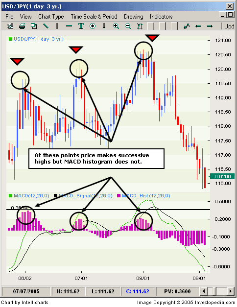
In effect, this strategy requires the trader to average up as prices temporarily move against him or her. This, however, is typically not considered a good strategy. Many trading books have derisively dubbed such a technique as "adding to your losers". However, in this case the trader has a logical reason for doing so - the MACD histogram has shown divergence, which indicates that momentum is waning and price may soon turn. In effect, the trader is trying to call the bluff between the seeming strength of immediate price action and MACD readings that hint at weakness ahead. Still, a well-prepared trader using the advantages of fixed costs in FX, by properly averaging up the trade, can withstand the temporary drawdowns until price turns in his or her favor. Figure 4 illustrates this strategy in action.


Figure 4 - The chart indicates where price makes successive highs but the MACD histogram does not - foreshadowing the decline that eventually comes. By averaging up his or her short, the trader eventually earns a handsome profit as we see the price making a sustained reversal after the final point of divergence.

Conclusion
Like life, trading is rarely black and white. Some rules that traders agree on blindly, such as never adding to a loser, can be successfully broken to achieve extraordinary profits. However, a logical, methodical approach for violating these important money management rules needs to be established before attempting to capture gains. In the case of the MACD histogram, trading the indicator instead of the price offers a new way to trade an old idea - divergence. Applying this method to the FX market, which allows effortless scaling up of positions, makes this idea even more intriguing to day traders and position traders alike.


By Boris Schlossberg, Senior Currency Strategist, FXCM

** This article and more are available at Investopedia.com - Your Source for Investing Education **
Google